Knowledge


The two maps from UT3 are both architecturally identical but thematically different. Creating these themes out of the same building acquires knowledge in many areas, such as colour, material, pathways and so on.
Knowledge in Flow

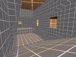
Flow is arguably the most important element of buildings, especially when it comes to high rise buildings with over 3 or 4 levels. It loosely provides pathways that a viewer could move around in a map interacting with components added. There are several characteristics that lead to good flow. The first and most crucial is the knowledge of layout, or the "blueprint" of the map--where the routes go and what connects where.
Layout can be broken down into several types of "set pieces." There are dead ends, long thin hallways, gigantic open spaces, and rooms with two exits. Then there are high-connectivity, medium-sized rooms with furniture, which are usually considered ideal. Standard Room-Corridor-Room layout (RCR) in which each room has exactly two exits, each leading to a long thin hallway, is a terrible layout because a player has only two choices: go forward, or go back. Much better is a room with at least three exits, preferably on different vertical levels, with interesting interiors for interaction. In general, wide-open spaces have numerous advantages over others as the viewer has a wide range of view from all directions. On the other hand, cramped areas are perfect for restricted movement and could lead the viewer to where you want him/her to go. Lastly, being the fact that the area is restricted, there has to be dead corners at each end. However, dead corners may also look interesting if there are interesting sceneries to look out for.

A quick and dirty looking interior covered with massive walls all around would not be the best place for the viewer to look into.
Knowledge in Visualisation
One of the most critical aspects of a map's visual design is making it feel like it's a real place. The map doesn't have to be strictly realistic, but it has to look that way. For example, a six-inch-thick brick wall should not be holding up a humongous warehouse, no matter whether it would be likely in Real Life. It simply looks better to have a wall that is several feet thick, regardless of the plausibility of such a wall in Real Life. The most important principle of knowledge is making the space feel logical. It must feel like the place has a purpose and the best but trickiest way to do this is to fill space with our given themes.
This map below has everything from creepy audiotapes left behind by former residents to messages written on walls in blood. In Addition, papers litter the ground and books spill off the desk, giving the impression of a struggle and hasty exit. The room has an atmosphere that someone actually lived there. Therefore knowledge is required to make the place feel like the themes we were given with.

A map's atmosphere is what the viewer sees in the map. It is what makes a viewer feel like they are in, a place, or rather it is the feeling of the place that the viewer tries to emulate; a sense of location. To better the atmosphere, knowledge on polygons, texture, lighting and sound is crucial.
The first part of building an effective atmosphere is to consider the location. What would such a place look like? What sorts of objects would be in it? Why does it exist? How does it work? And, importantly, am I capable of doing this? Answering these questions often involves knowledge or a Google search.
One of the most important aspects of detail is that you keep it consistent. If we have one area that looks amazing and another that looks rushed, the whole map is going to look crappier than if neither area was detailed. Adding little details may stress realism in the atmosphere but adding too many may make the map feel overcrowded. For example, we won’t need to add each individual blade of grass, but too few of them would make the map unfinished. Baring these knowledge in mind, we will plan to mix our three themes in a way that each detail would contribute towards the whole.
Knowledge in Texture
Knowledge in Texture


A picture is worth a thousand words. The picture above shows how images can differ just by applying some knowledge in texture.
Knowledge in Sound
Though often overlooked, sounds can add a humongous amount of atmosphere to a level. The four most important aspects to consider are amount, volume, source, and choice.
The human ear cannot discern more than two to four sounds at once, so we should try and avoid having more than three at a time. Source is also an important factor as each sound has to have a believable place that it’s coming from. We may add background sounds, like croaking frogs or chirping birds, if it fits accordingly to our given theme. "Foreground" sounds like the dripping water needs to come from a visible source of dripping water, and the sound should line up with the drips visually if possible. It's important have knowledge on the choice sound you are going to add because some sounds can be annoying and furthermore interrupt with our theme.
Certain actors and instances almost necessitate accompanying sounds. These include lifts, doors, puddles, and dripping or streaming water. Commonly, electrical equipment and generators will have a crackle, beep, or low buzz. Background sounds are often natural, including chirping birds, running water, rain, or an electrical hum. The reason why these knowledge in sound are so important is because they need to be recognisable; as soon as the viewer hears a sound, he or she would want to recognise this sound as well as where it's coming from.
Knowledge in Lighting
While all the elements mentioned above are crucial, good lighting can truly make a map outstanding. I believe that bad lighting won’t really make the entire visual impact horrific in most cases. But insufficient knowledge on lighting could show lack of effort.
It is said that the first and the most important rule is not to use the default white lighting. The second is to pick a congruent colour scheme and complement it to the rest of the visuals that already would have our given themes. An "ambient" colour would make up most of the lighting, as secondary colour would add some variation, and a third colour for particular emphasis and more variation. Third is to make sure all lights are sourced, meaning that the light must appear to come from a certain location, whether a sun in the skybox or a torch in a hallway. Lastly, light/dark contrast, especially when we use shadows. It is a great way to set off a certain area and add a visual appeal into the map.
댓글 없음:
댓글 쓰기