Context
My role for this week was to prepare the speech.
This is what I have wrote:
Conflict is a state of discord caused by the actual or perceived opposition of needs, values and interests. A conflict can be internal (within oneself) or external (between two or more individuals/themes or concepts). Conflict as a concept can help explain many aspects of social life such as social disagreement, conflicts of interests, and fights between individuals, groups, or organizations.
1.What opportunities are created by the conflicts in your proposal? Should these conflicts be 'resolved' or 'maintained'? Why?
Project’s proposal was to create an unbuilt architecture that matches our theme of conflict which was enclosed, exposed, hard/soft, public/private, affordable and unaffordable. Although it conflicted or was against the word “visually pleasing”, it created opportunities and clarified our intent. These conflicts should be both maintained and resolved accordingly.
3. How could you integrate conflict, positively, in your design process?
Integrating conflict is compulsory in design process. Without conflict there would be no improvement. There are few ways of integrating conflict in a design process.
First is setting a group leader that each individual agrees on and following his/her decision. This will avoid creating rough feelings against each other and help making decisions efficiently.
Second is brainstorming together. If each individual had done their tasks individually, there would be a high chance of miscommunication between each other, leading to conflict between individuals and the ideas they’ve worked on. To avoid this unnecessary process, getting together and brainstorming thoughts and ideas on the spot prevents misunderstanding.
Thirdly is communication. Although it would work best if all work was done together in person, this is unrealistic. Communicating from start to the end, whether it is by blog, msn, phone call or email, is compulsory yet an effective way of preventing misunderstanding, reducing unnecessary work and removing conflict.
Fourthly, experimentation was used to positively integrate texture. One wanted to add x texture to y area, while the other wanted to add z texture to y area. Same applied for background, lighting, sounding, furnishing and the overall context. Each individual having different ideas trying different methods and comparing them next to each other made the process crystal clear on which conflicts should be resolved and maintained.
Record, Hierarchy, Planning, Intent and each theme we have covered in class are positive methods of integrating conflict in the design process.
4. Very concisely describe any historical conflicts that have affected your site and that have, to some degree, been resolved by your building?
Fact: There is a history of conflict within Green point, between the first Dutch settlers and the native Indians. Burning farms and murdering children.
This division in classes was exacerbated in the site as the area is a poor district, whereas the surrounding are high skyscrapers.
Fact: The majority of transport was by boat and most of the settlement was involved with the water. In the 19Th century the area became industries and specialised in shipbuilding.
The architecture itself is to be built above the piers which is directly above water and near industrial specialised buildings specialised in ship building.
Fact: Towards the end of the 20Th century, residential areas were starting to be created from the old industrial buildings.
The surrounding residential area will remain as old buildings
Fact: Creative arts was becoming recognised in the area around the same time
There traces from these creative arts such as graffiti in walls and some damaged artworks will be left behind.
Fact: This increased the rent to make in one of Brooklyn's highest rental areas
This increase in rent resulted in increase homeless people. Avatars of homeless people will be added on site if possible.
Fact: Recent years have brought about a building proposition to introduce ~16,700 new residents with cheaper market rate housing
The fact is that market rate housing or as we say in Australia ‘affordable housing was impossible due to the conflict between rich and poor, and an intervention was needed to fix this disparity. These propositions will hopefully make this possible.
5. What are the areas of your proposal that require immediate attention? i.e. the weakest areas. Our weakest area that required attention for our intended proposal was:
Lack of experience in the unreal editor.
Our weakest area at the moment is creating the atmosphere we were intending. We are working towards using dynamic lighting, worn texturing and adding avatars to add a human, rough and realistic feel to the area.
2008년 6월 6일 금요일
2008년 5월 11일 일요일
Week8
Context
For the group presentaion, my role was to answer questions 3 and 4.
How does the function of the building influence the context?
The building represents a rather elaborate market-rate housing to be built above reconstructed piers in the Greenpoint neighborhood of Brooklyn, New York. The function or the architecture of the building influences Economic, Demographic and Environmental Impacts.
Firstly at the bottom of the building there is an outdoor shelter which provides shelter for the homeless. If the problem was only a lack of shelters for the homeless, it is predicted that they would be busier during the winter period. But more shelters do not solve the problem. Often on the street people shake with a big smile on their face saying 'I've got a place.' But often they end up spending most of their time on the streets alone because they just don't know anyone else other than other homeless people. Homelessness is about a lack of connectedness. Belonging somewhere is about belonging with other people, like belonging to a family or a local community. The largest social demographic in first world countries that experiences homelessness are actually the elderly who are houseful. Quite often their spouse has died and their children live at a distance. They feel the some loneliness and abandonment as the person living on the street.
The architecture of the building provides not only cheap rental housing, but provides a friendly shelter or an area for the homeless to gather. The outdoor shelter not only provides an area for people streets sleepers, but also for people who feel lonely. The function of the architecture helps them gather and create their own friendly community. This way it would solve the problem of feeling homeless and would look better for the overall neighborhood of Brooklyn.
Secondly, function as a high rise building maximizes the use of space. It therefore provides housing for lots of people in the space provided. By doing this it is able to achieve its aim to provide cheap rental units that are affordable to low and moderate income households.
Thirdly, the reason why this architecture was to be built above reconstructed piers plays an important role. Maintaining an economically diverse residential base is critical to the health of the city. The addition of new housing units such as market rate-hosusing in a growing area is a necessity and an automatic outcome of population shifts. In declining areas, developing new housing is often a challenge, but it is viewed as an important economic development strategy. By retaining residents or attracting new ones to the city, local leaders hope to capture additional tax revenue. New housing not only adds to the residential property tax base, but can also contribute to the commercial property tax base by attracting new businesses. The reason for choosing "Market rate housing" was because of its cheap housing in a bad area. This is the reason why this architecture is to be built above reconstructed piers in the Greenpoint. As an industrial area with a shipping history, it was still being used as a port. Although a lot smaller than neighboring ones, this was an affordable place which was best to be targeted.
Could the context be changed and not affect the inferred concept?
In researching the context surrounding our choice of building and its history, we found that the project’s concept or its aim was to provide cheap housing in a high capacity area with comparatively high rents.
It is difficult for the context to change and not affect the inferred concept. The surrounding context such as the location, time, and history is what makes the place it is now. The concept is derived from these contexts and would not be possible to keep the concepts if the surrounding context changed.
In the 19th century, Greenpoint neighborhood of Brooklyn was used as an industrial location specializing in shipbuilding. Placing market-rate housing at this location at this period of time just does not make sense.
Towards the end of the 20Th century, residential area were starting to be created from the old industrial buildings as creative arts was becoming recognised in the area, which increased the rent to make Brooklyn one of the highest rental areas. With the boost in rental prices having to think of building market-rate housing was just off the topic.
Having to bring forward this idea only came in the recent years when building propositions introduced on bringing 16,700 new residents with cheaper market rate housing. In the year 2000, with the increase of rent throughout Green point; most people left for cheaper areas, as the homeless continued to survive out on the streets. A new development was promised by the council to produce a new area at the waterfront to accommodate some of the homeless with cheaper market rate rents. This was when the concept was made available.
As stated above, context is what makes the concept. Our group believes that concept can only be made when the situation allows it to be made.
Week7
Hierarchy
According to the definition in the wikipeida “A hierarchy is an arrangement of objects, people, elements, values, grades, orders, classes, etc., in a ranked or graduated series. The word can also refer to a series of such items so arranged. Items in a hierarchy are typically thought of as being "above," "below," or "at the same level as" one another.
In terms of collaboration, each individual’s role and responsibilities has to be identified in order for success in completion of the project. Structured hierarchy allocates responsibilities to each individual from the leader demanding tasks, giving orders, making decisions; to workers completing and reporting completed work in return for their wage. This type of hierarchy has been working for generations.
Hierarchy in relation to our building:
The building “market-rate housing” in a way also provides a hierarchy. Firstly, is it’s location. The building represents a rather elaborate market-rate housing to be built above reconstructed piers in the Greenpoint neighbourhood of Brooklyn. It is being built in an industrial area with a shipping history, as it is still being used as a port. Although it is situated in the city, it is also situated away from the city where the skyscrapers are. This is because it is affordable and considered a poor location compared to the rest of the city. This division creates a sort of hierarchy.
The indoor shelter located at the top and the outdoor shelter located below also creates hierarchy. Although aimed at people with low incomes, it divides people with low incomes with homeless people, who live at the outdoor shelter beneath them. Low meaning poor and higher meaning wealthier with better views creates hierarchy.
Reference
http://en.wikipedia.org/wiki/Hierarchy
2008년 4월 29일 화요일
Week6
http://arch1392c.wetpaint.com/page/arch1392+C+Home/thread is our wiki
From the presentation last week, some issues were raised:
what is market rate?
why is it important?
why do they need market rate housing?
history of the region (green point peers) ?
The unbuilt architecture we used represented a rather elaborate market-rate housing to be built above reconstructed piers in the Greenpoint neighborhood of Brooklyn, New York.
For many households, rental housing is a preference; for others, it is a financial necessity. With few exceptions, only households at the high end of the low-income rangecould afford any of the houses that were for sale. For the rest, rental housing is often the onlychoice. Households with limited choices include in-movers, especially recent immigrants; youngworkers; long-term workers in low-wage jobs; and older residents with limited incomes.
Market rate housing provides some rental units that are affordable to low and moderate income households.
Maintaining an economically diverse residential base is critical to the health of a municipality. The addition of new housing units such as market rate hosusing in a growing area is a necessity and an automatic outcome of population shifts. In declining areas, developing new housing is often a challenge, but it is viewed as an important economic development strategy. By retaining residents or attracting new ones to the city, local leaders hope to capture additional tax revenue. New housing not only adds to the residential property tax base, but can also contribute to the commercial property tax base by attracting new businesses.
The reason for choosing "Market rate hosuing" was because of its cheap housing in a bad area. It would be full of junkies and squatters would be interesting to of play around, in such an open area with little furnishing, and dark gloomy shadowy lighting. On the other hand, its background has images of skyscrapers. We believed that the conflict between the two was interesting. The area may look dark and gloomy but as the viewer looks further ahead there would be bright sunny environment conflicting the area. It would be interesting to show this in a UT3 environment.
INTENT
My definition of itent is "If you are intent on doing something, you are eager and determined to do it." Intent in terms of digital collaboration is designs that are created for a purpose.
As mentioned in last week's presentation we started off with choices of buildings. Each of us intended to work on different buildings of their choices and narrowed it down to 2 buildings.
In terms of knowledge, the market rate building had the most information given to us in terms of plans, sections, views and so on. Conflict, as mentioned above, matching our three themese given. Through out discussions our intent was to choose the Market rate hosuing.
http://www.mc-mncppc.org/research/analysis/housing/affordable/CH2.pdf
http://urban.csuohio.edu/economicdevelopment/knight/tools/land/marketrate.htm
2008년 4월 19일 토요일
Week 5
My part in the group was to find out the different types of knowledge we need for the best outcome, researching on different examples of previous maps already made.
Knowledge

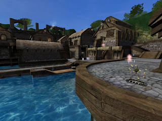
Layout can be broken down into several types of "set pieces." There are dead ends, long thin hallways, gigantic open spaces, and rooms with two exits. Then there are high-connectivity, medium-sized rooms with furniture, which are usually considered ideal. Standard Room-Corridor-Room layout (RCR) in which each room has exactly two exits, each leading to a long thin hallway, is a terrible layout because a player has only two choices: go forward, or go back. Much better is a room with at least three exits, preferably on different vertical levels, with interesting interiors for interaction. In general, wide-open spaces have numerous advantages over others as the viewer has a wide range of view from all directions. On the other hand, cramped areas are perfect for restricted movement and could lead the viewer to where you want him/her to go. Lastly, being the fact that the area is restricted, there has to be dead corners at each end. However, dead corners may also look interesting if there are interesting sceneries to look out for.
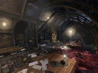
This map below has everything from creepy audiotapes left behind by former residents to messages written on walls in blood. In Addition, papers litter the ground and books spill off the desk, giving the impression of a struggle and hasty exit. The room has an atmosphere that someone actually lived there. Therefore knowledge is required to make the place feel like the themes we were given with.
A picture is worth a thousand words. The picture above shows how images can differ just by applying some knowledge in texture.
Knowledge in Sound
The human ear cannot discern more than two to four sounds at once, so we should try and avoid having more than three at a time. Source is also an important factor as each sound has to have a believable place that it’s coming from. We may add background sounds, like croaking frogs or chirping birds, if it fits accordingly to our given theme. "Foreground" sounds like the dripping water needs to come from a visible source of dripping water, and the sound should line up with the drips visually if possible. It's important have knowledge on the choice sound you are going to add because some sounds can be annoying and furthermore interrupt with our theme.
Certain actors and instances almost necessitate accompanying sounds. These include lifts, doors, puddles, and dripping or streaming water. Commonly, electrical equipment and generators will have a crackle, beep, or low buzz. Background sounds are often natural, including chirping birds, running water, rain, or an electrical hum. The reason why these knowledge in sound are so important is because they need to be recognisable; as soon as the viewer hears a sound, he or she would want to recognise this sound as well as where it's coming from.
Knowledge in Lighting
While all the elements mentioned above are crucial, good lighting can truly make a map outstanding. I believe that bad lighting won’t really make the entire visual impact horrific in most cases. But insufficient knowledge on lighting could show lack of effort.
It is said that the first and the most important rule is not to use the default white lighting. The second is to pick a congruent colour scheme and complement it to the rest of the visuals that already would have our given themes. An "ambient" colour would make up most of the lighting, as secondary colour would add some variation, and a third colour for particular emphasis and more variation. Third is to make sure all lights are sourced, meaning that the light must appear to come from a certain location, whether a sun in the skybox or a torch in a hallway. Lastly, light/dark contrast, especially when we use shadows. It is a great way to set off a certain area and add a visual appeal into the map.
Knowledge


The two maps from UT3 are both architecturally identical but thematically different. Creating these themes out of the same building acquires knowledge in many areas, such as colour, material, pathways and so on.
Knowledge in Flow
Flow is arguably the most important element of buildings, especially when it comes to high rise buildings with over 3 or 4 levels. It loosely provides pathways that a viewer could move around in a map interacting with components added. There are several characteristics that lead to good flow. The first and most crucial is the knowledge of layout, or the "blueprint" of the map--where the routes go and what connects where.
Layout can be broken down into several types of "set pieces." There are dead ends, long thin hallways, gigantic open spaces, and rooms with two exits. Then there are high-connectivity, medium-sized rooms with furniture, which are usually considered ideal. Standard Room-Corridor-Room layout (RCR) in which each room has exactly two exits, each leading to a long thin hallway, is a terrible layout because a player has only two choices: go forward, or go back. Much better is a room with at least three exits, preferably on different vertical levels, with interesting interiors for interaction. In general, wide-open spaces have numerous advantages over others as the viewer has a wide range of view from all directions. On the other hand, cramped areas are perfect for restricted movement and could lead the viewer to where you want him/her to go. Lastly, being the fact that the area is restricted, there has to be dead corners at each end. However, dead corners may also look interesting if there are interesting sceneries to look out for.

A quick and dirty looking interior covered with massive walls all around would not be the best place for the viewer to look into.
Knowledge in Visualisation
One of the most critical aspects of a map's visual design is making it feel like it's a real place. The map doesn't have to be strictly realistic, but it has to look that way. For example, a six-inch-thick brick wall should not be holding up a humongous warehouse, no matter whether it would be likely in Real Life. It simply looks better to have a wall that is several feet thick, regardless of the plausibility of such a wall in Real Life. The most important principle of knowledge is making the space feel logical. It must feel like the place has a purpose and the best but trickiest way to do this is to fill space with our given themes.
This map below has everything from creepy audiotapes left behind by former residents to messages written on walls in blood. In Addition, papers litter the ground and books spill off the desk, giving the impression of a struggle and hasty exit. The room has an atmosphere that someone actually lived there. Therefore knowledge is required to make the place feel like the themes we were given with.

A map's atmosphere is what the viewer sees in the map. It is what makes a viewer feel like they are in, a place, or rather it is the feeling of the place that the viewer tries to emulate; a sense of location. To better the atmosphere, knowledge on polygons, texture, lighting and sound is crucial.
The first part of building an effective atmosphere is to consider the location. What would such a place look like? What sorts of objects would be in it? Why does it exist? How does it work? And, importantly, am I capable of doing this? Answering these questions often involves knowledge or a Google search.
One of the most important aspects of detail is that you keep it consistent. If we have one area that looks amazing and another that looks rushed, the whole map is going to look crappier than if neither area was detailed. Adding little details may stress realism in the atmosphere but adding too many may make the map feel overcrowded. For example, we won’t need to add each individual blade of grass, but too few of them would make the map unfinished. Baring these knowledge in mind, we will plan to mix our three themes in a way that each detail would contribute towards the whole.
Knowledge in Texture
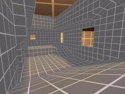
Knowledge in Texture

A picture is worth a thousand words. The picture above shows how images can differ just by applying some knowledge in texture.
Knowledge in Sound
Though often overlooked, sounds can add a humongous amount of atmosphere to a level. The four most important aspects to consider are amount, volume, source, and choice.
The human ear cannot discern more than two to four sounds at once, so we should try and avoid having more than three at a time. Source is also an important factor as each sound has to have a believable place that it’s coming from. We may add background sounds, like croaking frogs or chirping birds, if it fits accordingly to our given theme. "Foreground" sounds like the dripping water needs to come from a visible source of dripping water, and the sound should line up with the drips visually if possible. It's important have knowledge on the choice sound you are going to add because some sounds can be annoying and furthermore interrupt with our theme.
Certain actors and instances almost necessitate accompanying sounds. These include lifts, doors, puddles, and dripping or streaming water. Commonly, electrical equipment and generators will have a crackle, beep, or low buzz. Background sounds are often natural, including chirping birds, running water, rain, or an electrical hum. The reason why these knowledge in sound are so important is because they need to be recognisable; as soon as the viewer hears a sound, he or she would want to recognise this sound as well as where it's coming from.
Knowledge in Lighting
While all the elements mentioned above are crucial, good lighting can truly make a map outstanding. I believe that bad lighting won’t really make the entire visual impact horrific in most cases. But insufficient knowledge on lighting could show lack of effort.
It is said that the first and the most important rule is not to use the default white lighting. The second is to pick a congruent colour scheme and complement it to the rest of the visuals that already would have our given themes. An "ambient" colour would make up most of the lighting, as secondary colour would add some variation, and a third colour for particular emphasis and more variation. Third is to make sure all lights are sourced, meaning that the light must appear to come from a certain location, whether a sun in the skybox or a torch in a hallway. Lastly, light/dark contrast, especially when we use shadows. It is a great way to set off a certain area and add a visual appeal into the map.
2008년 4월 15일 화요일
Week 4
We finally decided on the unbuilt buidling, which was Market-Rate Housing in Brooklyn, NY (Lewis Wadsworth, Yale School of Architecture)
Reference
We roughly divided our roles in terms of modelling, texture, lighting, sounding and animating.
We decided that for our presntation, we would require
- Large images
- Sound
- Points (graphical fonts) to describe the images
- Video record
for a clearer communication to the audience.
In addition, I went and looked at some Archmodels, which may help in our project for modelling
Below are some examples.
Record
Record can be done using virtually any form of energy, spanning from manual muscle power in handwriting, to acoustic vibrations in phonographic recording, to electromagnetic energy modulating magnetic tape and optical discs.
In regards to an architectural collaboration, it would be keeping or managing data from meetings or discussions and ideas. This type of record can be done by writing notes from the meeting. It would be one of essential factors that a group would need. This could come in handy when bringing ideas forward and also looking back at some previous ideas the group has made. Getting it typed up on blog will help the group members to have easy access to what they have done and what they have do. It will also help members of the group who have unfortunately missed out on meetings and help them catch up.
Recording information in terms of digital collaboration could come in many ways.
Writing notes
Posting it up on blogs
Voice recording
Video recording
Posting it up on blogs
Voice recording
Video recording
Reference
Archmodel 22, 25, 26, 29, 33
2008년 4월 8일 화요일
Week 3(2)
More unbuilts buildings that the group can choose from:

The owner desired expansive panoramic and sunset views across Savannah State Park Fresh Water Lagoon. To capture these views as well as breezes on the setback, restrictive site, the architect placed the main living spaces on the third level. Three-story wall planes of 12-inch masonry units with a shell-tabby texture anchor the 24-foot “double-wide” structure. “Pop-outs” of operable glass and lapped siding provide views to the south and east, while the stair tower floods the center of the residence with light and offers views during one’s vertical journey. The jury called the project, “A unique concept. Very simple plan with wonderful spatial sequences and orientation of the interior spaces to the surrounding environment.”

American Exposition Pavilion, by John Burgee Architect
As lead Architectural Designer, my concept was to bring people to the top floor of this exhibition building via a glass enclosed elevator which would give the visitor wonderful views of the New York City Public Library. This elevator is the front door. From there the visitor would descend down a series of ramps back out to the next-to-busiest street corner in NYC. The facade itself would be composed of electricallly controlled transluscent glass panels providing a surface for backlit street presentations at night. The panels would themselves be coriographed to alllow objects to appear to float around the facade. Inside there would be a virtual reality stations which would emerse the visitor in the realm of the displays.
Reference
Article: New York Times, July 30, 1992.
"The Sparks Medical Office Building and Pharmacy won the AIA Merit Award for an Unbuilt Project at the AIA Columbus awards ceremony. The pharmacy will be the first building designed in London in two decades. It will include a pharmacy and medical clinics and will bridge the gap between downtown London and nearby commercial and residential areas in the Madison County community."

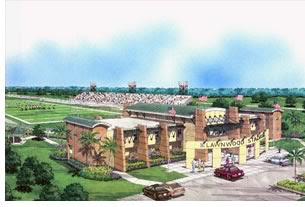
Lawnwood Stadium Administrative Building (Unbuilt), St. Lucie County, Fla., by Edlund, Dritenbas, Binkley Architects & Associates PA
For this major renovation and addition to a stadium ticket office, the architects plan to construct administration offices above the existing structure. This “air-right” approach eliminates the need for stormwater engineering that would have been required for a new, freestanding building on this impervious site. In addition, the design adds a vertical and visual gateway identity for the stadium entry and an elevated view of the 85-acre park for management staff. It also offers a skybox stadium view from the conference room area. “The addition is a very creative and sensitive solution that adds to the whole facility while segregating the private office areas,” the jury enthused. “The overall design is well sited and properly scaled. It adds elegance to a really simple stadium.”Rendering courtesy Huddleston Art Studio.

Granfield Residence (Unbuilt), Jensen Beach, Fla., by Granfield Granfield Architects
The owner desired expansive panoramic and sunset views across Savannah State Park Fresh Water Lagoon. To capture these views as well as breezes on the setback, restrictive site, the architect placed the main living spaces on the third level. Three-story wall planes of 12-inch masonry units with a shell-tabby texture anchor the 24-foot “double-wide” structure. “Pop-outs” of operable glass and lapped siding provide views to the south and east, while the stair tower floods the center of the residence with light and offers views during one’s vertical journey. The jury called the project, “A unique concept. Very simple plan with wonderful spatial sequences and orientation of the interior spaces to the surrounding environment.”

American Exposition Pavilion, by John Burgee Architect
As lead Architectural Designer, my concept was to bring people to the top floor of this exhibition building via a glass enclosed elevator which would give the visitor wonderful views of the New York City Public Library. This elevator is the front door. From there the visitor would descend down a series of ramps back out to the next-to-busiest street corner in NYC. The facade itself would be composed of electricallly controlled transluscent glass panels providing a surface for backlit street presentations at night. The panels would themselves be coriographed to alllow objects to appear to float around the facade. Inside there would be a virtual reality stations which would emerse the visitor in the realm of the displays.
Reference
Article: New York Times, July 30, 1992.
피드 구독하기:
덧글 (Atom)


